I can’t believe how happy I am to finally being able to talk about this! It was a big part of my work days for the most of 2022 and 2023, the bane and joy of my days and one of the biggest challenges I worked on up until now. I will break this post in chapters: it’s a huge project, I have plenty to say and I want to talk about it with the care it deserves. For the time being, I’m going to post this story just in English: it’s quite articulate, and translating it in Italian is going to take some time. I’ll get to it, but it’s just English for now. I’ve divided this post on the illustrations for the Erbil Citadel Children Interpretation Center in four parts:
- Tl;dr: I made a bunch of illustrations for the Erbil Citadel Children Interpretation Center!
- The Erbil and Southern Mesopotamia timelines
- The Erbil Citadel wooden model drawers
- The Now & Then memory game, plus assorted thoughts and thank yous
Tl;dr: I made a bunch of illustrations for the Erbil Citadel Children Interpretation Center !
At the beginning of 2022, Federica Pascotto called me to talk about this job they were involved in, centering around designing activities for children on the history of Mesopotamia. They were looking for a number of illustrators suitable for the task, in terms of style, experience on creating illustrated tools to communicate heritage sites to kids, and an affinity for projects that entail a significant amount of research besides drawing. That’s how I like to imagine the conversation between her an Roberta Menegazzi from Centro Ricerche Archeologiche e Scavi di Torino per il Medio Oriente e l’Asia, the head archeologist on the project:
Do you know any illustrator that is that big of a nerd?
Yes, as a matter of fact, we actually did.
I know that’s not how it happened, but that’s how I like to picture it.
Because I AM a huge nerd! And being the nerd that I am, I had already in my portfolio an illustration inspired by ancient Mesopotamian mythology: the mušḫuššu – a dragon-snake-lion-eagle hybrid with eagle hind legs, lion-like forelimbs, a long neck and tail, two horns and a snake tongue – that appears on the Ishtar Gate of Babylon. I like to think that the mušḫuššu was my lucky charm. Thanks, beautiful crazy-eyed mythical cutie.
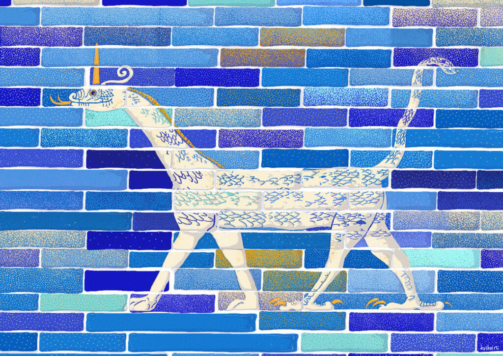
So, in April 2022 we kicked off the activity. And what was it precisely, pray tell?
Well, it was designing the illustrations for the outfitting of the educational tools for the Erbil Citadel Children Interpretation Center. Erbil, also called Hawler, is the capital and most populated city in the Kurdistan Region of Iraq. All the works on the Children Interpretation Center was made inside the framework of the World Monuments Fund in conjunction with the High Commission for Erbil Citadel Revitalization (HCECR). In recognition of the Outstanding Universal Value, the Erbil Citadel was inscribed in the World Heritage List of UNESCO in June 2014.
Human settlement at Erbil dates back to the 5th millennium BCE, and one of the earliest historical references to the site dates to the Third Dynasty of Ur of Sumer. Sooo… no biggie, uh?
Erbil Citadel is thought to be one of the longest continuously inhabited sites in the world. More than 6,000 years of uninterrupted history. It looks like a spaceship, a mothership landed on Earth, and that’s because the Citadel is built on a tell. A tell is not a naturally occurring geological formation, but a mound created by many generations of people living and rebuilding on the same spot. Isn’t this mind-blowing?
I was tasked to design three parts of the set-up for the CIC spaces: the Erbil and Southern Mesopotamia timelines, the Erbil Citadel wooden model drawers, and the Now & Then memory game.


pictures courtesy of WMF and @Elham M.Salim
The Erbil and Southern Mesopotamia timelines
The main outfitting of the CIC is the Timeline, both for its dimensions (more than eight meters), and because it was the most difficult tool to implement, from a design, illustration and also technical standpoint.
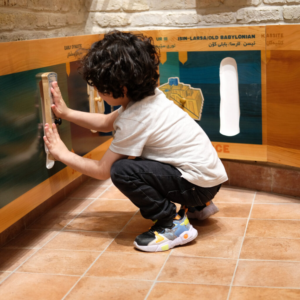
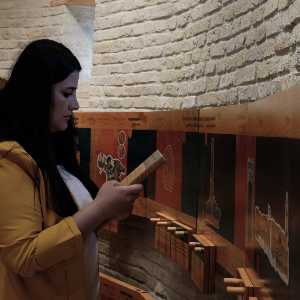
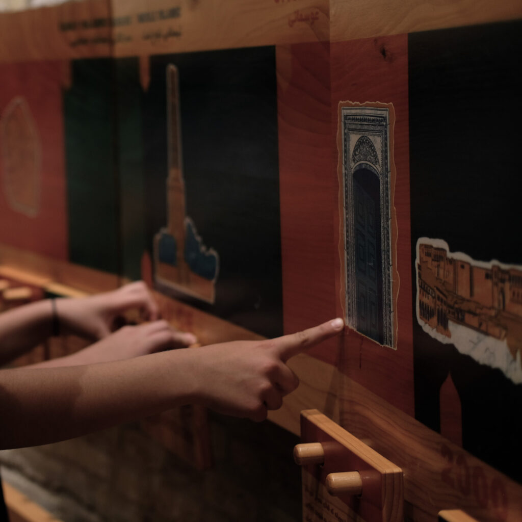
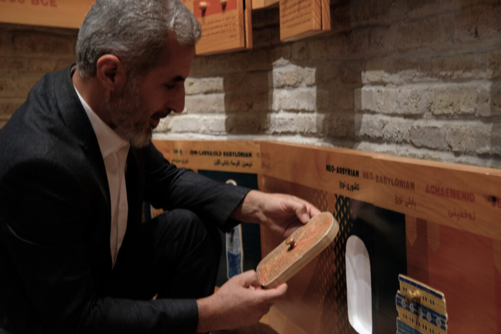
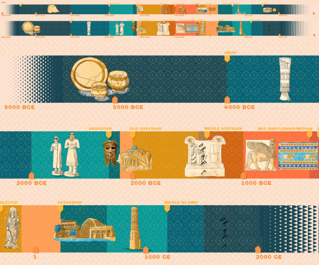
The timeline is actually two timelines, both of them more than eight meters long. The upper one shows the main events and archaeological records in Erbil’s history, and the lower one depicts the key moments and findings in the broader context of Southern Mesopotamian history. The upper timeline is a tool to engage mostly with older children – the target audience of the CIC will be school groups of children under the age of 12, families with their children, and children visiting the Citadel as tourists. It features movable panels recounting significant events and archaeological findings in the history of Erbil: kids can play with them by trying to guess which caption matches with each illustration.
The Southern Mesopotamia timeline, on the other hand, is aimed mostly at younger children. It’s designed like a shapes puzzle game with movable blocks: visitors can interact with the history of the region by matching the illustrated puzzle pieces with the fitting spaces, each of one representing a period in time. The two timelines stand one above the other, so you can see at glance how the history of Erbil is linked with the broader history unfurling in the world at the same time. (And what a history it is,small stuff like, I don’t know, Hammurabi’s code??)
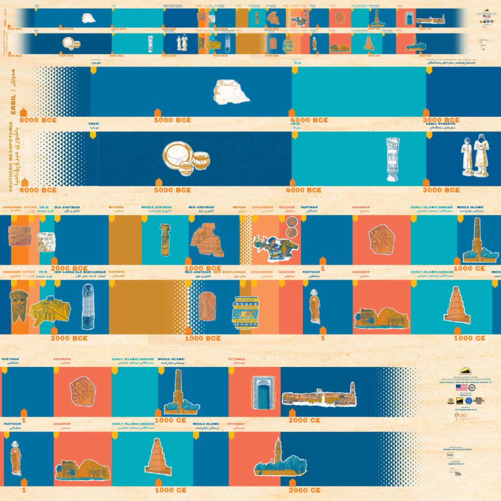
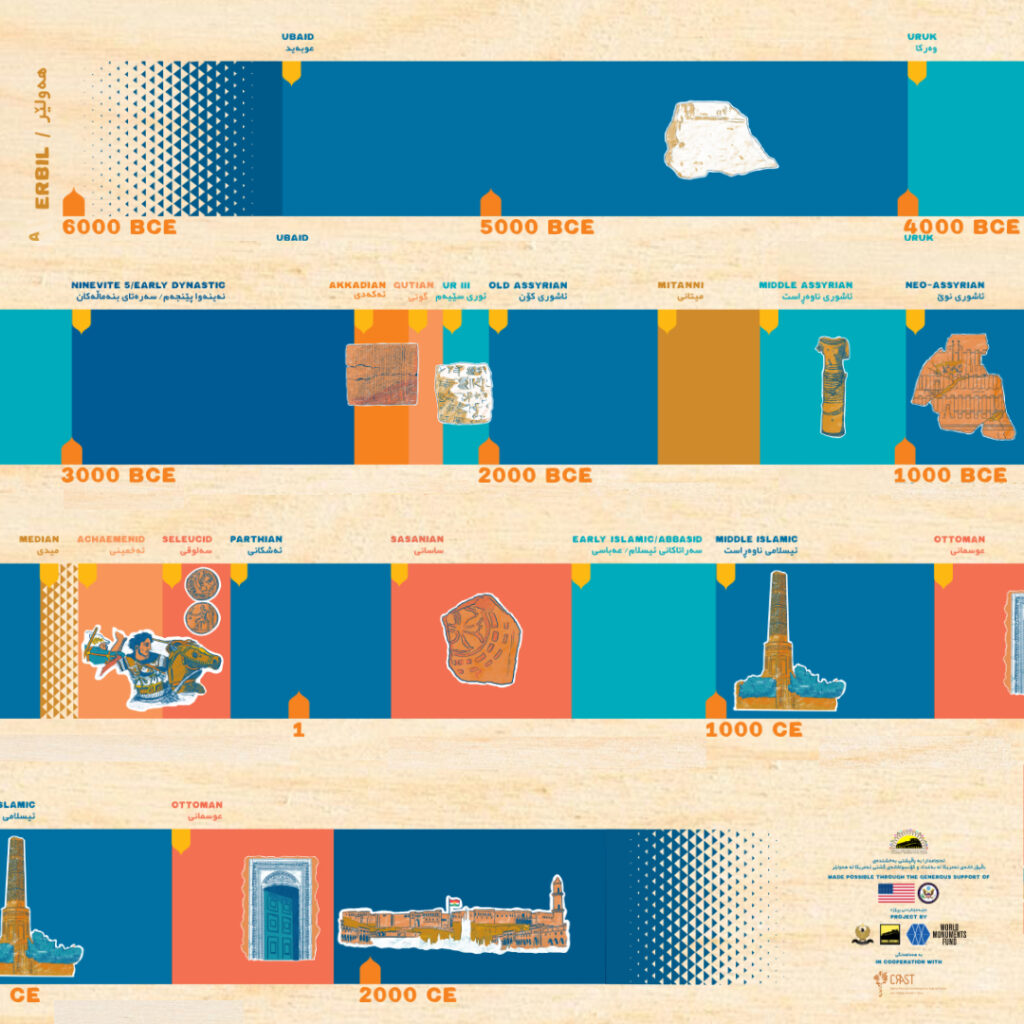
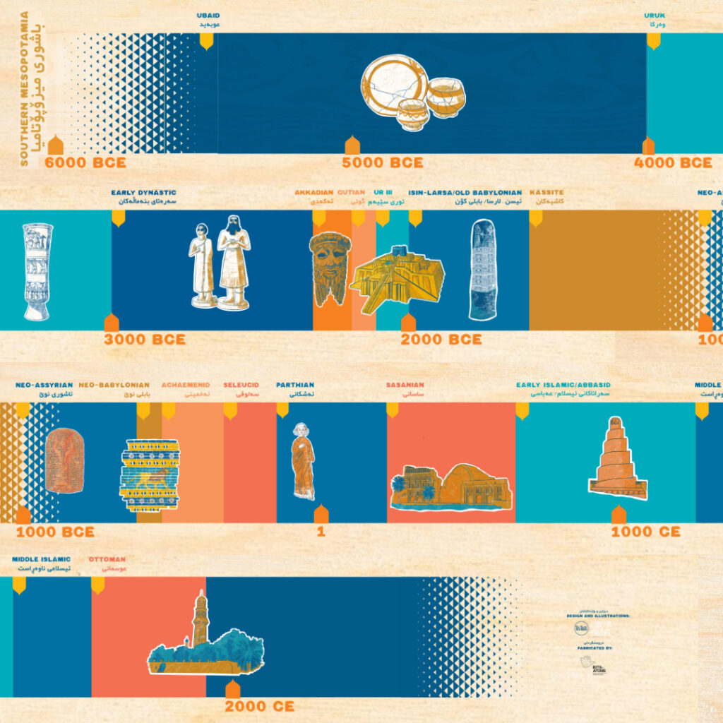
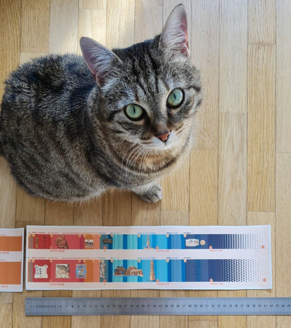
The challenge in designing a timeline is that every centimeter of space means something in terms of passage of time: you have to strike a delicate balance between historical accuracy and keeping all the elements in harmony. Not too crowded and not too sparse, put the artifacts in the spot that reflects their most accurate dating, but also keep anything important clear of the joints between panels, everything should have a legible shape and be recognizable at glance, even if a mosaic is definitely bigger than a little bronze statuette. This is a tall order even when you’re designing for a straight wall, just imagine how difficult it is to also account for a curved wall with a narrow angle. We spent days – actually weeks – moving things around inch by inch, calculating how much space we need to keep everything legible, and designing the tool so that children can easily interact with the game without having to squeeze in narrow spaces. After every major redesign I printed a small paper version of the timeline, in scale with the original, just to verify with a ruler the measurements we had on the project files.
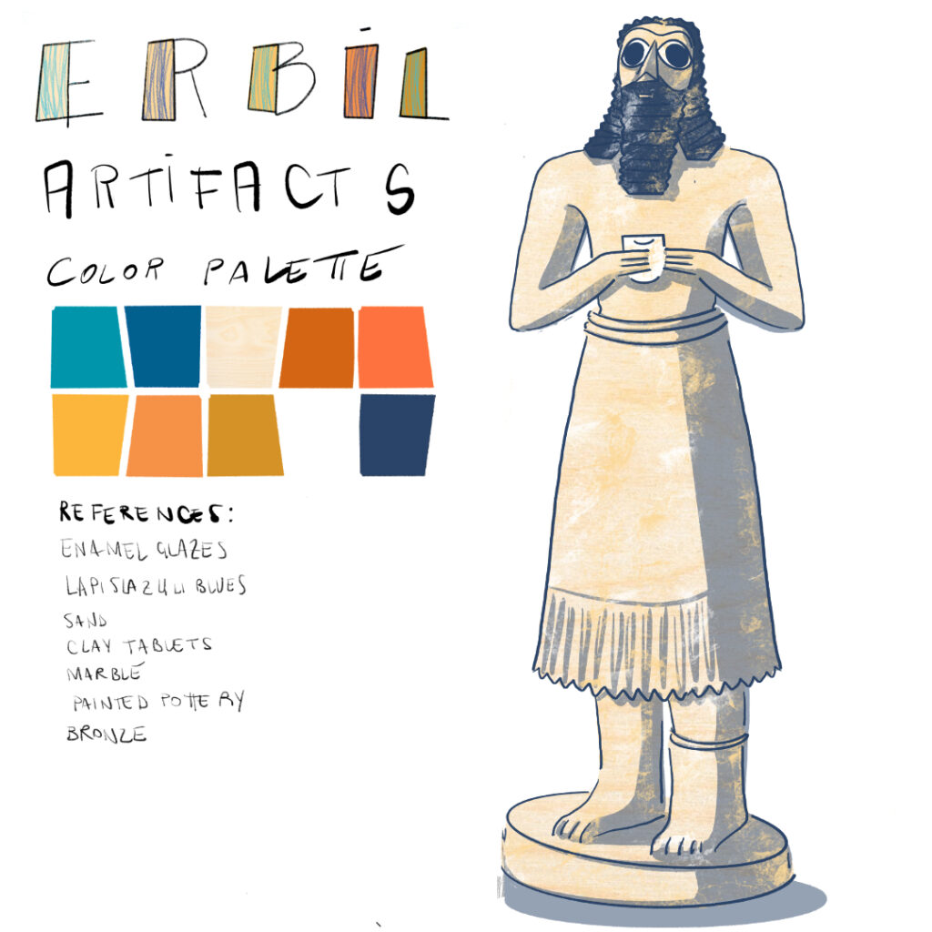
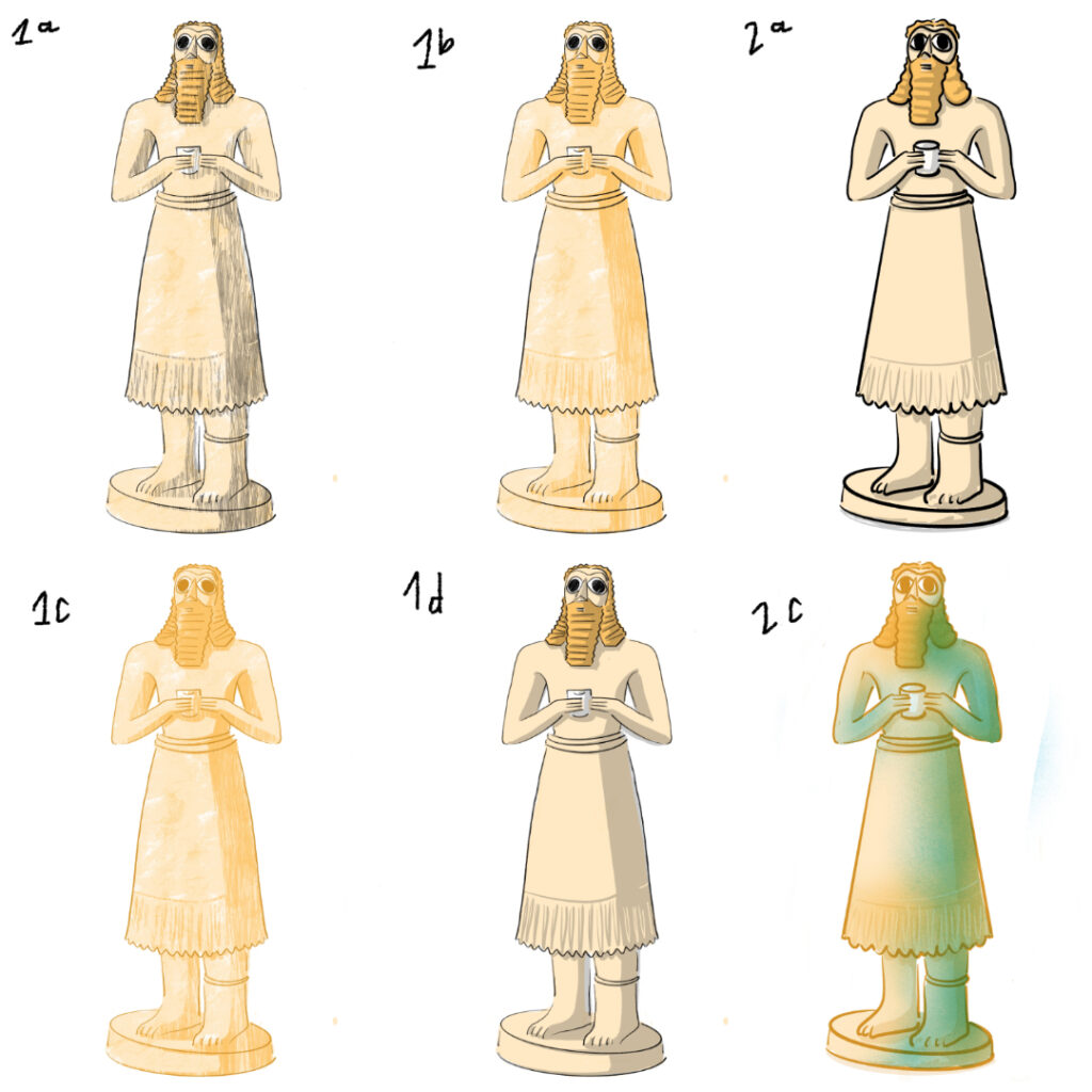
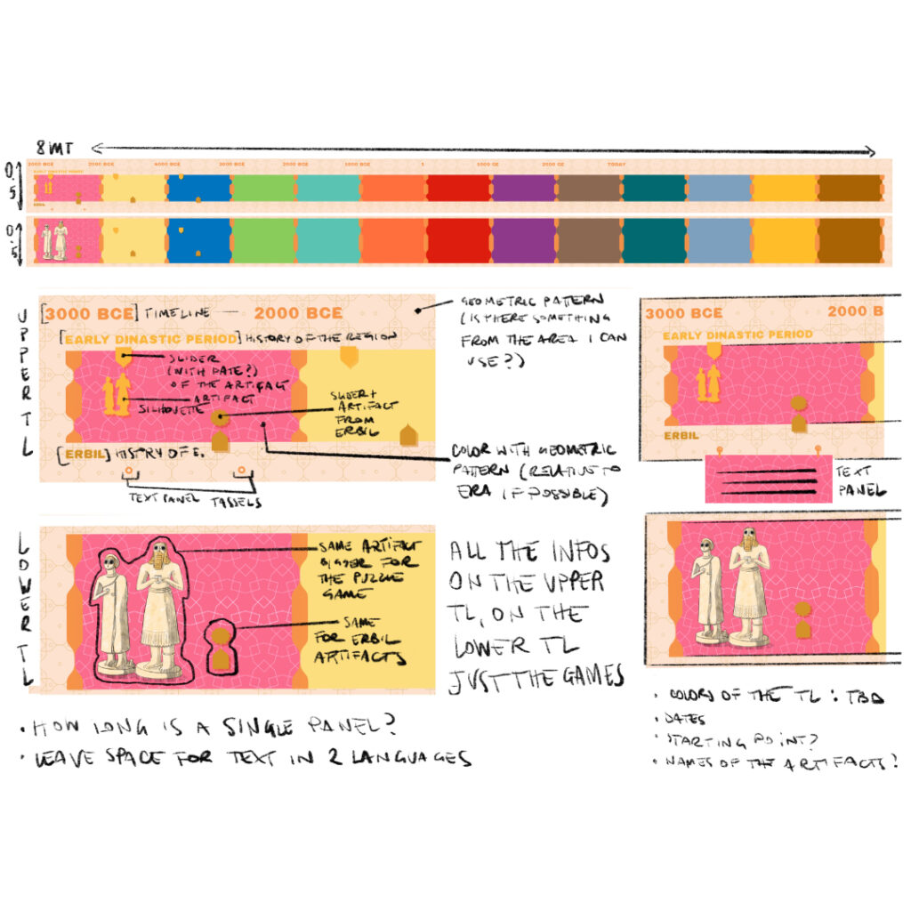
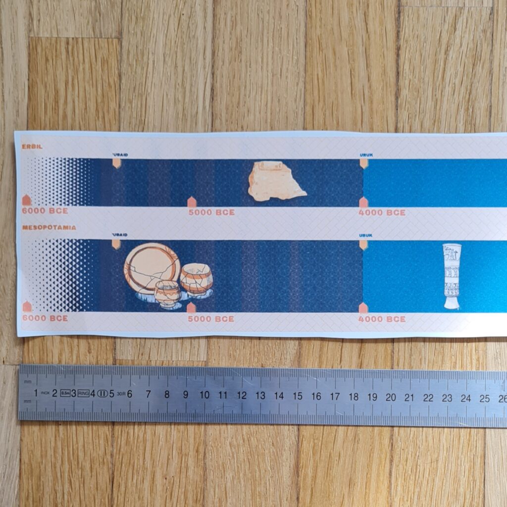
One of the earliest iterations of the illustrations for the Erbil Citadel Children Interpretation Center timeline and my valiant assistant
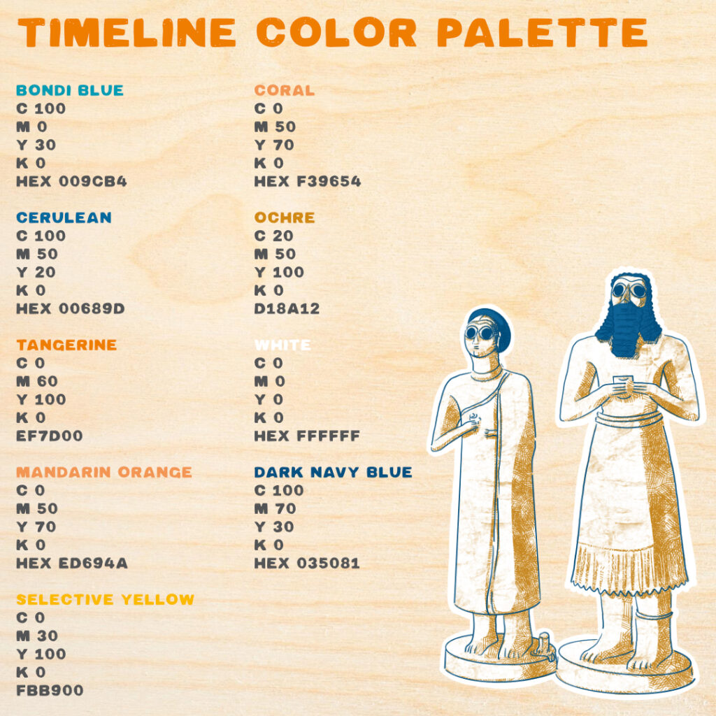
The color palette naturally emerged from the artifacts I was working on: the warm hues of clays, the vibrant blues of the enamels, the brightness of marbles. At the very beginning of the sketching phase the final medium for the timeline was still being decided, so I started with a colorful palette that made ample use of patterns. I draw inspiration from regional recurring motifs, like the ones on the ornate ceilings and colonnades from the houses in Erbil.
After a couple of iterations it became clear that we were going to work with wooden panels, so I dropped the patterns: the texture and variety in color was going to be provided from the natural veneer of the wood. (I didn’t discard the patterns, though, they were going to come in handy further down the road with the memory game). I spent some time studying the basics of printing on wood in order to adapt the color palette to our printing necessities. Printing on wood 101 was just the first of the many accelerated courses of studies I had to undertake during this project! Screenprinting also meant designing a more restrained color palette, while still having to repeat the color codes that corresponded to different time periods: this meant balancing beauty and legibility, avoiding the placement of similar colors near one another (too confusing) and also preventing strident contrasts.
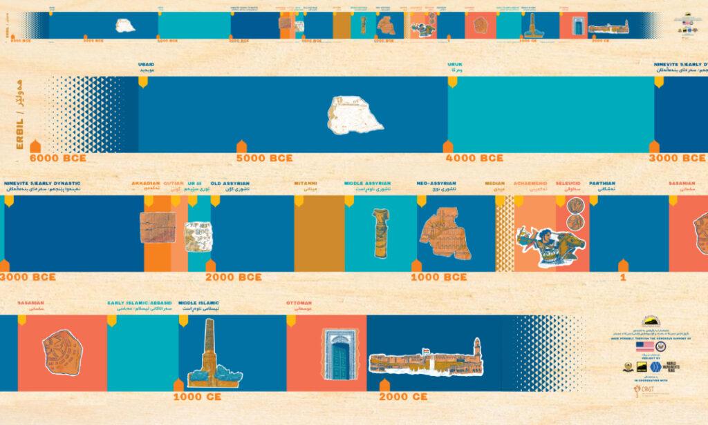
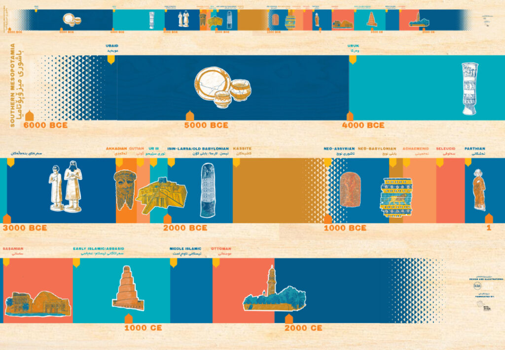
I used a fading pattern for the beginning and the end of the timelines, and for every historical point with a less definitive dating assigned to: my intent was to showcase that there is no such thing as a fixed beginning point of history, and there is definitively not an ending point. History is always ongoing.
Using a limited palette also meant striking a balance between fidelity to the artifacts without using naturalistic, mimetic colors: they need to be recognizable and useful as a tool for teaching history, but also fun, engaging, attractive to the onlookers. I spent a lot of time reviewing every iteration of the artifacts with Roberta Menegazzi. Then, every proposal went through the local team in Erbil. Speaking of archaeological finds, I would like to introduce you to a fun game I call “drawing ancient relics with cuneiform writings with absolutely no knowledge of cuneiform whatsoever”: squiggle or symbol? crack in the clay or symbol? shadow in the picture or symbol? cat’s hair in the scanner or symbol? Hours and hours of entertainment, indeed.
Choices had to be made about an issue more relevant than you would think: how much of the artifact I could show? The legibility and accuracy in size of the illustration shouldn’t compromise the consistency of the timeline, where every inch corresponds to an era. In the case of the lions from the Ishtar gate, it was a bit sad having to choose a single lion to save space, in lieu of the strikingly beautiful procession of imposing animals; in the case of the Alexander Mosaic depicting the Battle of Issus, I audibly exhaled a sigh of relief when we came to the conclusion that showing Alexander and Bucephalus was enough, instead of the intricate mess of bodies and spears and swords and terrified people and animals that is ancient warfare.


During the printing of the puzzle pieces, the act of balancing became much more literal: we had to decide where to place the handles in order to preserve the integrity and legibility of the image and the literal balance point of the piece, so that the children could play with them in complete safety.
And then there was the matter of the texts. The captions on the timeline are bilingual, and the movable panels and drawers inside the Citadel Wooden Model are trilingual: English, Arabic, and Kurdish. I went for big caps with a hand-painted feel font for the English captions – caps are usually more easily readable by younger children. But what about the Arabic and Kurdish text? Well, I did what I usually do in these cases: I studied. And boy did I have my job cut out for me. I had to take an accelerated course of study on the very basics of right-to-left languages in terms of typography, a brief oh so very brief history of Arabic type design and the influence of calligraphy, the many problems of a western-centric approach to font design and the technical challenges of laying out text in a language you don’t know, in a writing system you are not familiar with. In the end I relied heavily on the experience of the translation team, to which I owe an enormous thank you for their patience. (Also, I would like to mention how big of an headache it was when I found out that the Affinity Suite is not well suited for right-to-left writing systems. I found a work-around for this: call me if you ever need my tutorial “right-to-left texts on Affinity Suite without crying”).
The Erbil tell Citadel wooden model: history as drawers
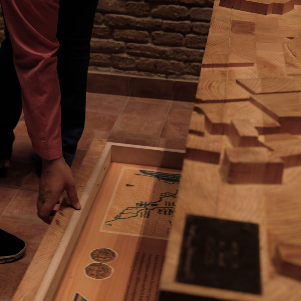
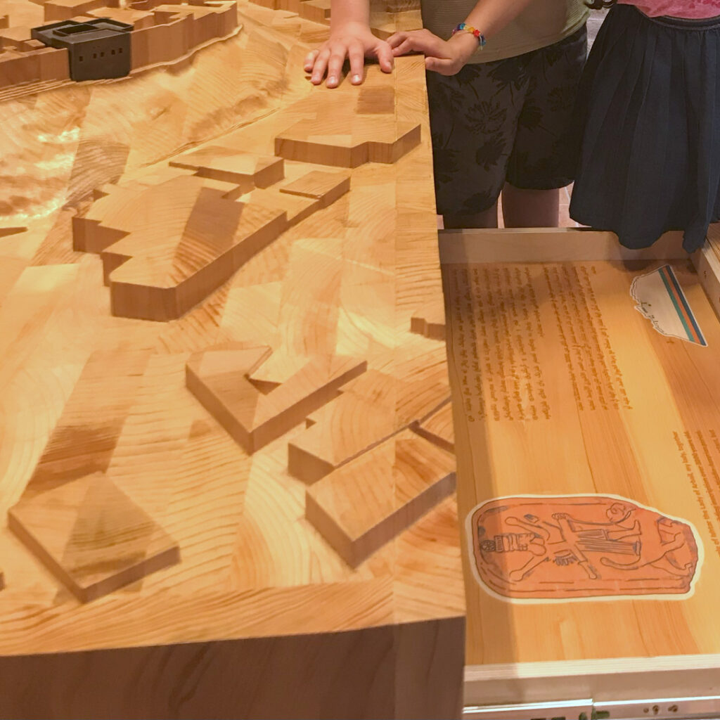
The other main fixture of the CIC is the Citadel model. It’s a 3D wooden model of the Erbil Citadel. The Citadel looks like a fortified settlement, with a continuous wall of tall 19th-century façades that conveys the impression of a mighty fortress, with its main features dating back to Erbil’s Ottoman phase. Being settled on a tell (a hill created by many generations of people living and rebuilding on the same spot) there are strata after strata of urban history lying under the Citadel. The stratification of the settlement inspired the idea of using drawers, one above each other, like periods of time “flowing” in layers rather than on a straight line. Each drawer is more or less 1000 years apart, and all together they tell the story of the city from the first settlement to the Middle Ages:
- the first and lowest drawer starts with prehistoric times, the Ubaid period, and the history and importance of pottery making;
- the second drawer is about the emergence of cuneiform writing and the first reference of Erbil in writing;
- the third drawer is focused on the Middle Assyrian period and the importance of the temple of the goddess Ishtar for the city;
- the fourth drawer is about the Neo Assyrian period, the importance of water management in the area, and the the big engineering feats of the time;
- the fifth drawer places Erbil in the biggest picture of the area during the Parthian era;
- finally, the sixth and highest drawer shows Erbil during the Islamic era, with a map of the city and the monuments from that time that are still standing.
A stylized icon of the Citadel with different colored “slices” helps you understand where you are in time.


Every drawer had a big ornate band with a pattern from that era (I told you the patterns would turn out to be meaningful after all) :
- the Ubaid drawer is decorated with a geometric pattern that was common in Ubaid pottery finds – I used the ones from Tepe Gawra;
- the second drawer has two lines of cuneiform writing from an Akkadian tablet;
- the Middle Assyrian drawer has a band inspired by a cylinder seal depicting a scene of devotion to Ishtar of Arbela;
- the Neo Assyrian has a river pattern with fishes from a relief depicting the capture of a fortress in Egypt;
- the Parthian drawer has a band inspired by an ornate coeval coffin;
- and finally the Abbasid drawer is inspired by the geometric brick pattern on the Choli minaret in Erbil.
The kids can open the drawers and peer inside in autonomy or with the help of the museum guides and facilitators: this way, they can experience in a simple physical manner the history layered under their very feet.
The Now & Then Memory game, plus assorted thoughts and thank yous
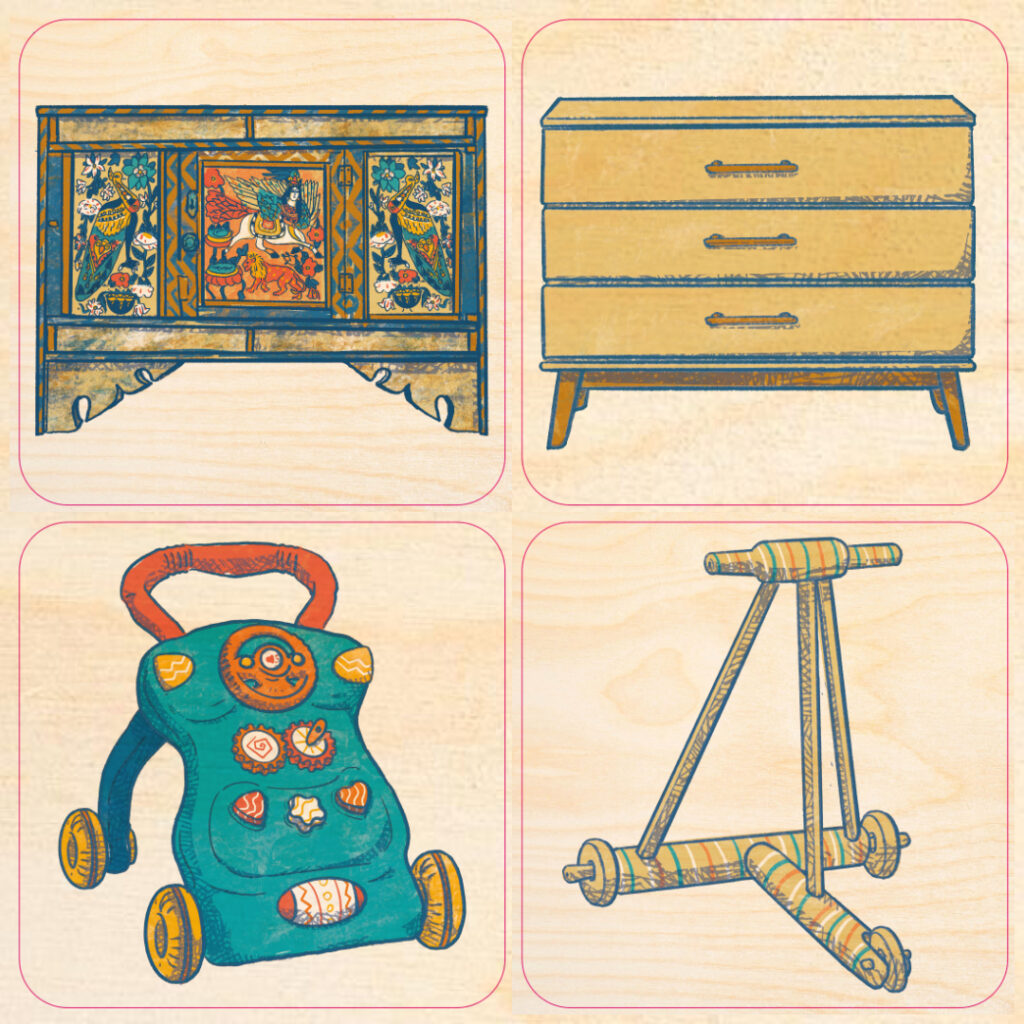
The final batch of illustrations for the Erbil Citadel Children Interpretation Center was a deck of 28 Memory cards. Instead of matching identical cards, the game asks kids to match a common item from daily life in the past with its corresponding modern item, i.e. an object that today is used for the same purpose as the ancient one. For instance, a pen and ink set and a pencil case, a samovar and an electric kettle, a hand mortar and a spice grinder. This game helps children to link the past with the present, to see the differences and similarities between our life today and life back then, to realize how the daily concerns and necessities of people were the same then and now. The available materials and technology changed, but not the basic needs we address with them. We used as a main reference some of the objects that are on display at the Erbil Textile Museum. This way, the CIC is linked to other museum spaces in the city, and our game helps children to engage with the other exhibitions as well, and in a meaningful way. I also learned a lot: I didn’t know that baby walkers were such an old tool, and what are the most common models of boomboxes around teens in Milan, Turin and Erbil.
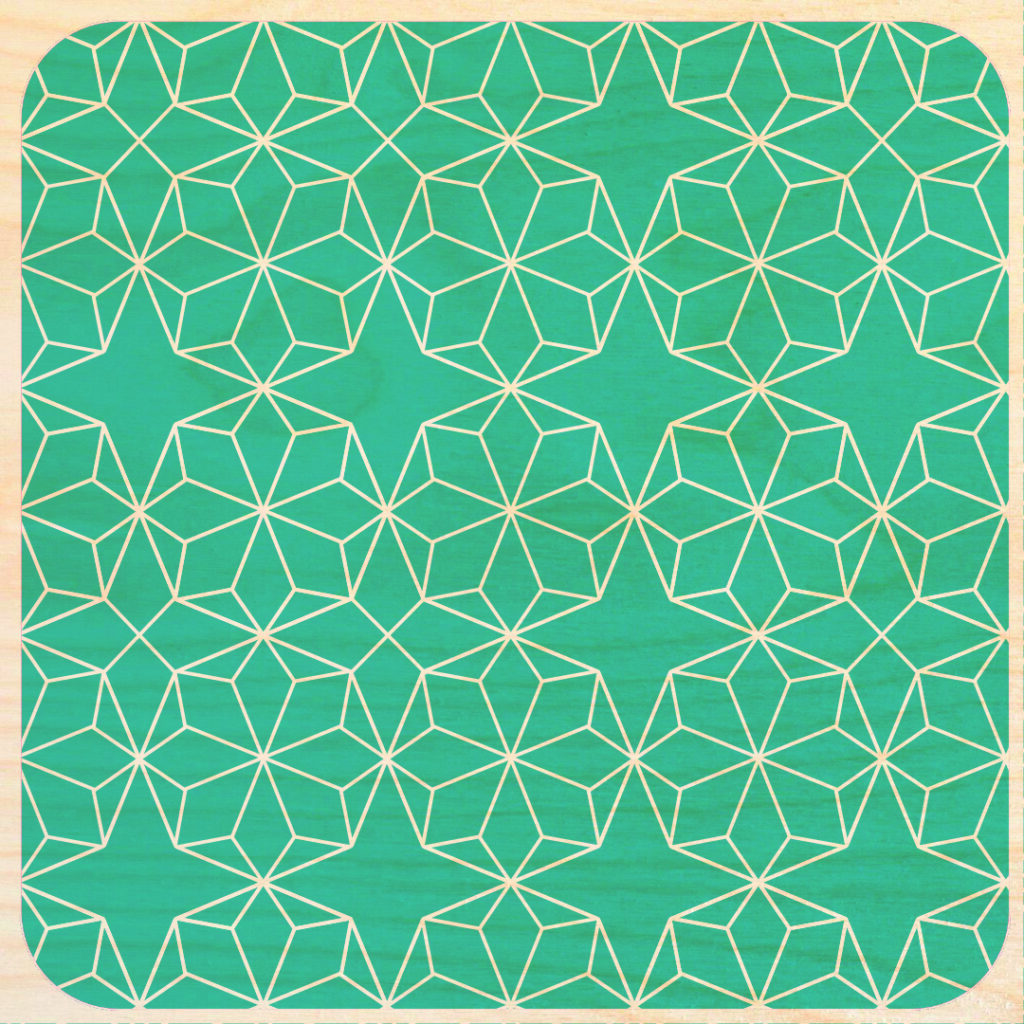
The unused pattern from the timeline ended up on the back of the cards, another way of linking together the different tools and spaces inside and outside the Children Interpretation Center.
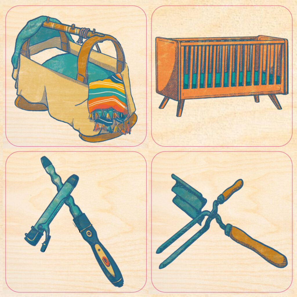
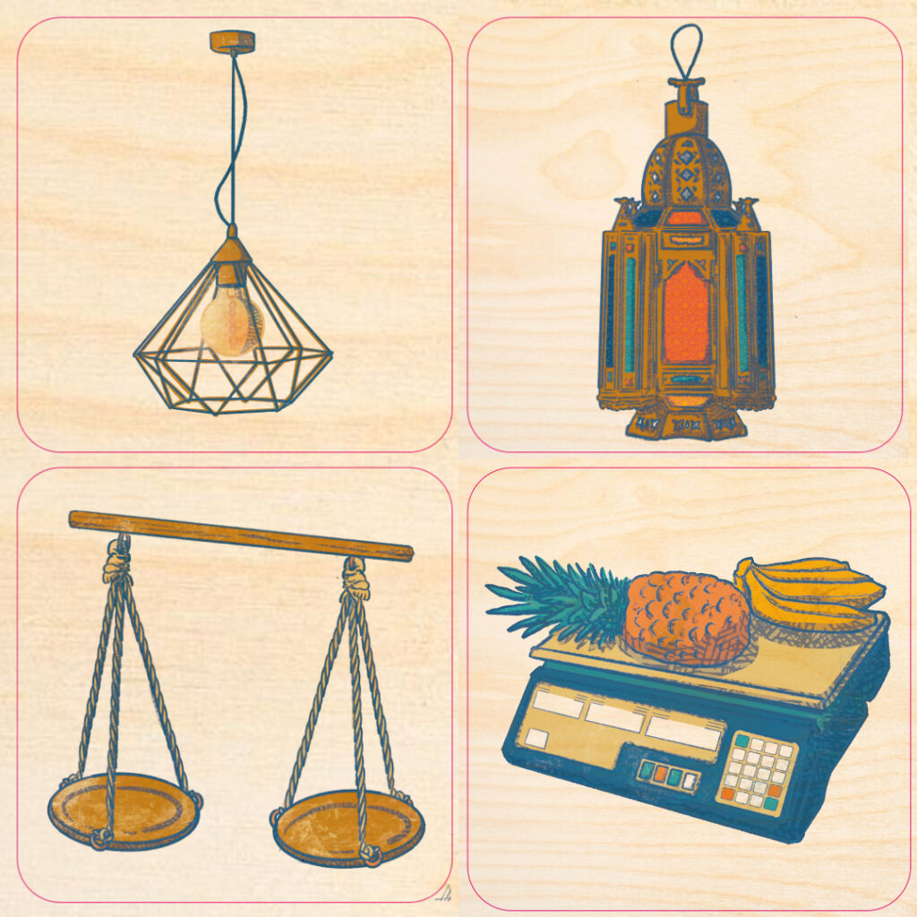
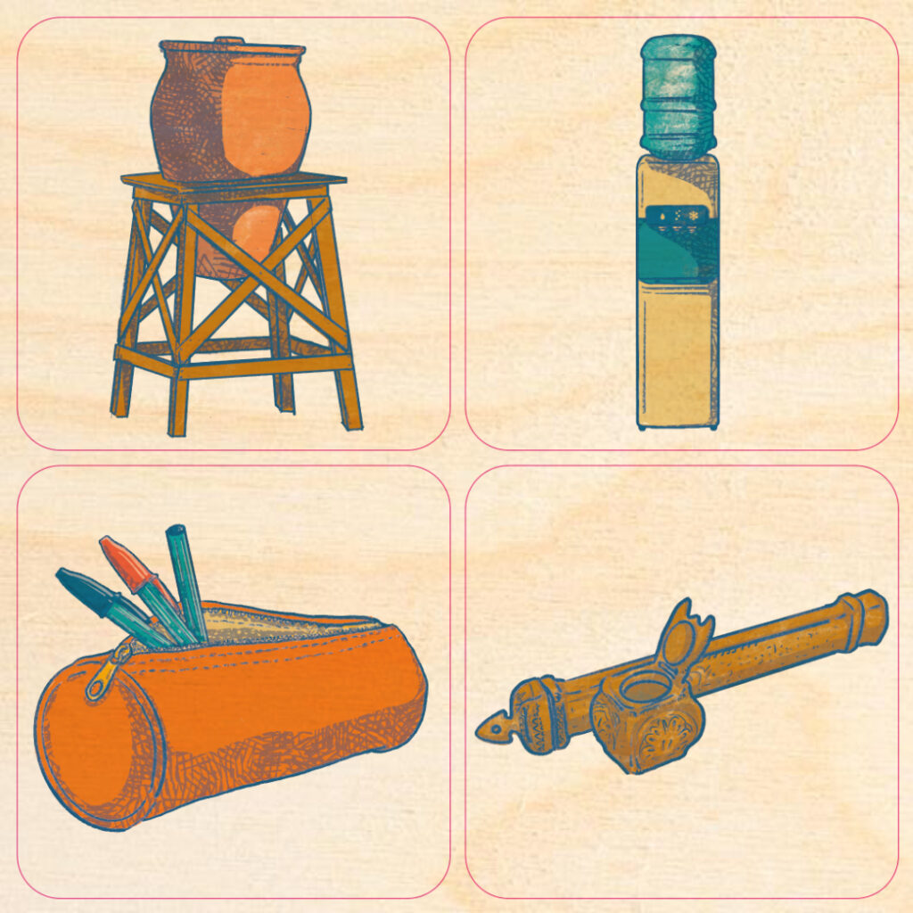
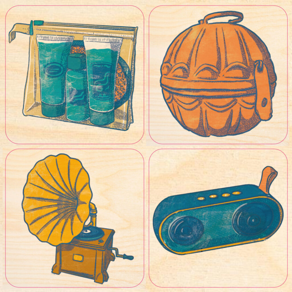
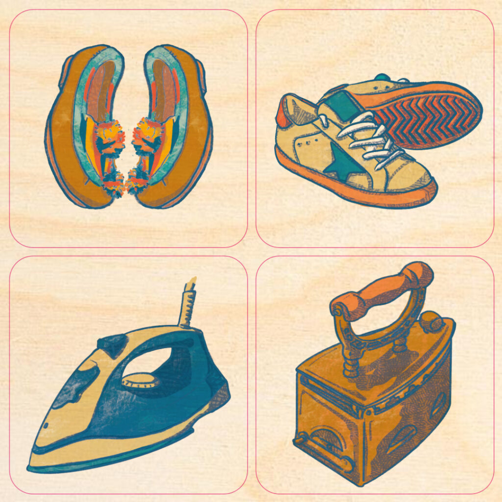
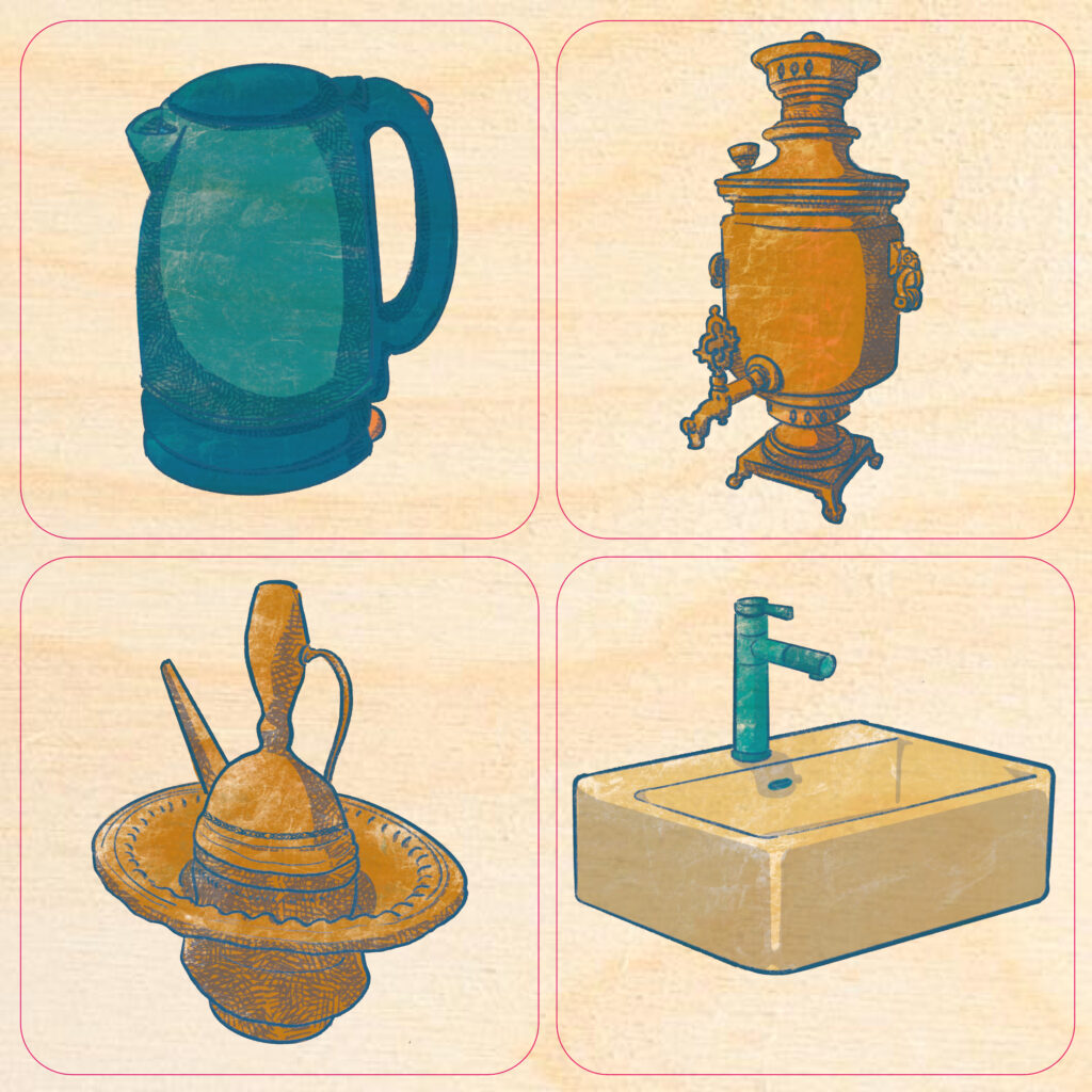
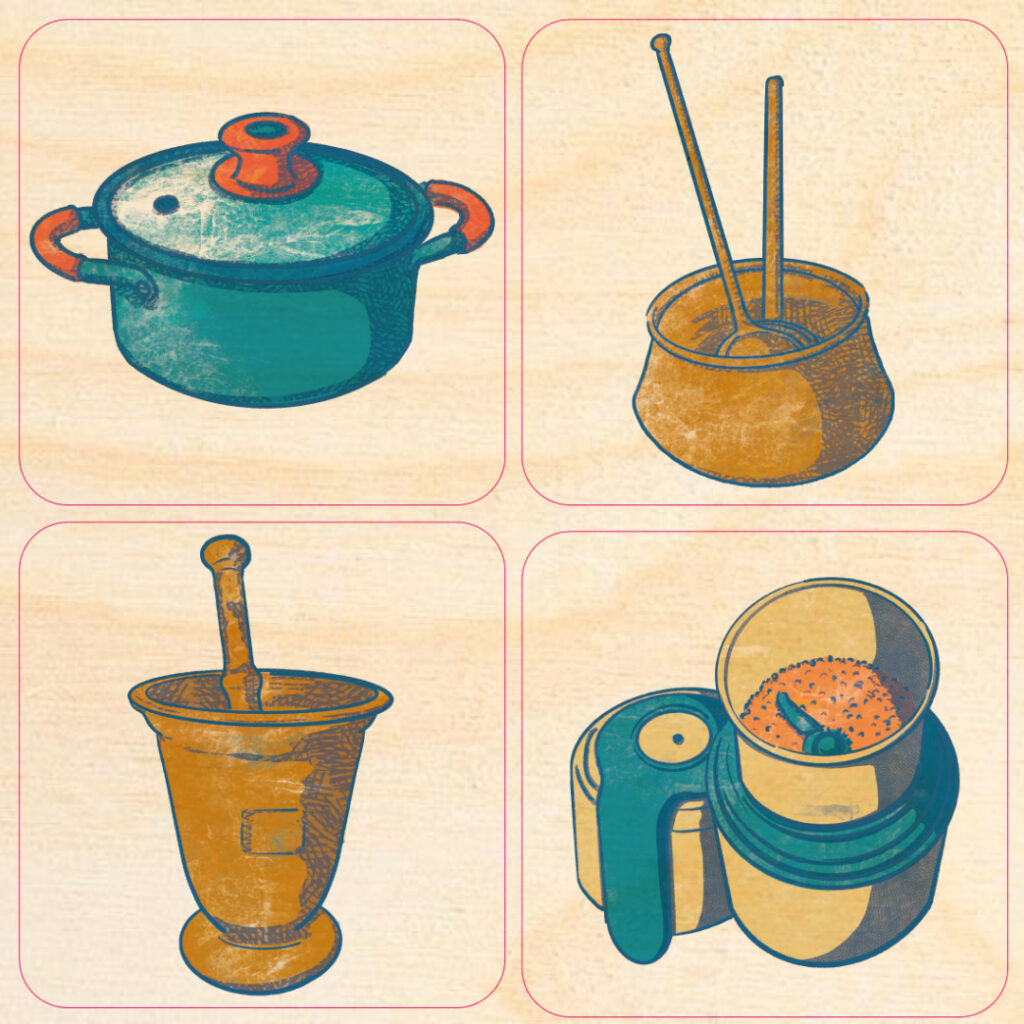


My illustrations are not the only tools at the kids’ disposal: there are also a comic book, an animated video about the history of Erbil, and big model of ancient Erbil houses. Each part of the exhibit work with the others, tying together the informations, showing different sides of the same history, and helping children of different age groups to interact with the contents of the museum in an effective way.

There is so much more I would like to say about this project, but this post is already incredibly long, so I think I will leave the bits and bobs and funny anecdotes for my Instagram feed. If you want you can experience a 360° virtual tour through the rooms thanks to Qaflab.
Still, I can’t end without thanking a bunch of people: Federica Pascotto from Bartolomeo Education for throwing my hat in the ring for this job; Alessandra Peruzzetto from World Monument Found; Bit to Atoms; Donald Insall Associates; Andrea Oberosler, Sokar Dler, Ahmed Zand and everyone from the CIC and HCECR in Erbil for their work and feedbacks on …well, more or less everything. But the biggest thank you is for Roberta Menegazzi, the amazing archaeologist from Centro Ricerche Archeologiche e Scavi di Torino per il Medio Oriente e l’Asia that was my person of reference in this project: in the last two years I think I have spent more time talking with her than with my partner, mother, friends and extended family combined. This was one of the most interesting, difficult, challenging, fun things I did as an illustrator up until now. Children’s spaces are critical in museums – and everywhere else, really. Not an abstract “oh kids are so precious”, but in a very real and practical terms: kids are people with needs and ideas that deserve our respect, our attention and time. I can’t believe that from now on thousands of kids will engage with such an important part of human history, an unbroken line of cultures stretching back 6000 years and still linked to them and all of us, through something that I have imagined and drawn in my little studio.
